

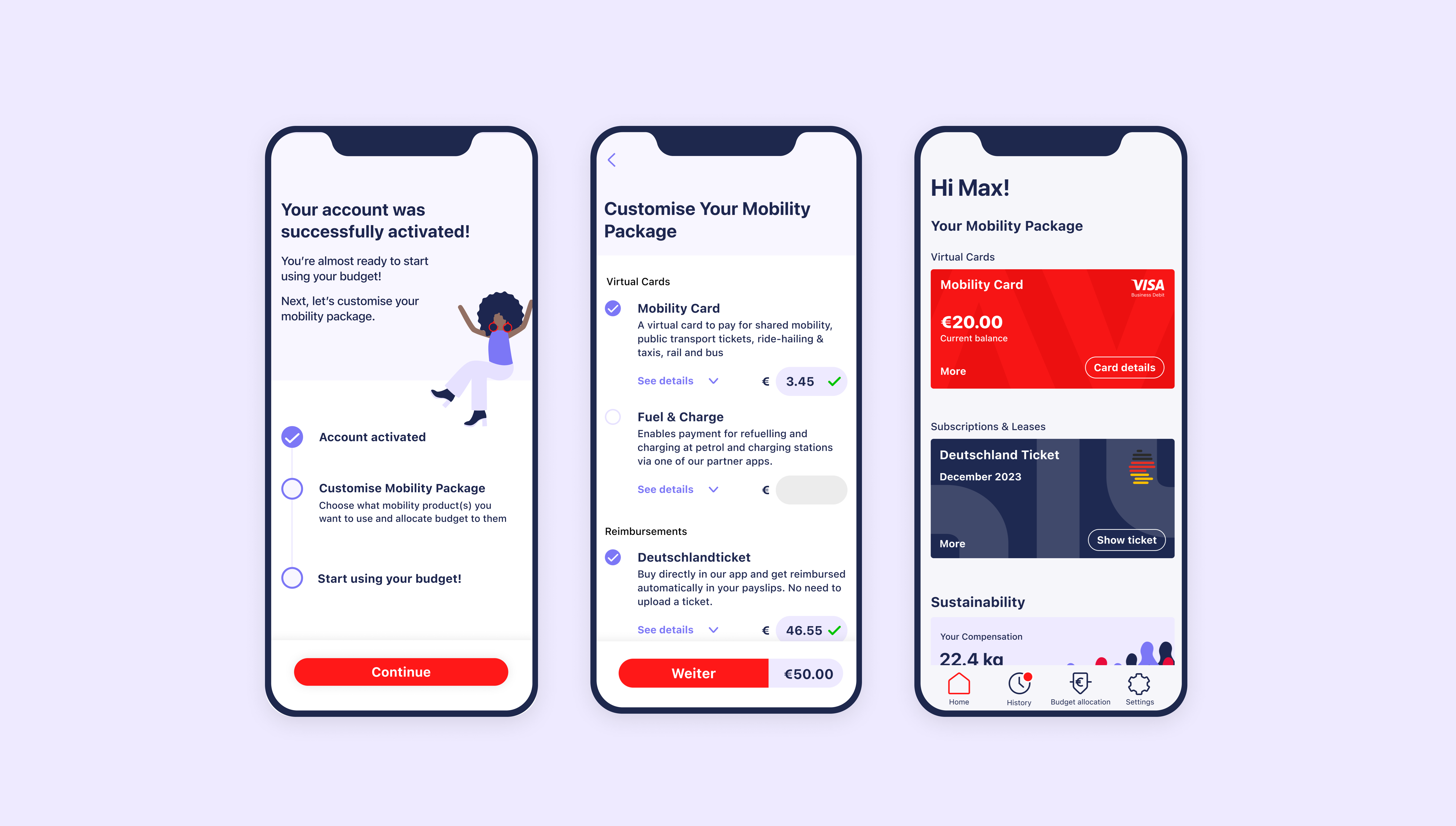
The NAVIT mobility benefits app got a redesign that addressed and solved user challenges in understanding mobility packages, processing options, product differences and usage. Our team revamped the app to improve accessibility, guidance and clarity on benefits, budget allocation and product usability.
Users lack a clear understanding of their mobility package, editing options, product differences, and usage instructions. This leads to frustration, confusion, and a decrease in perceived value from NAVIT. It also contributes to an increased support workload.
We redesigned the app to provide users with better access, guidance, and clarity regarding benefits, product usage, and budget limitations. Our aim was to enhance transparency and improve user experience.

Through implementation of continuous research into our process, we found that:
- Users lacked clarity on whether they could change their options and how
- Users struggled with understanding how to use products and spend their allocated budgets
- Limited understanding of mobility packages and their functionality
- Confusion caused by changes in budget allocation
- Unclear differentiation between products, worsened by a card-based visual representation
“I don’t know why anyone would choose public transit or bike leasing if the red card includes everything”
User Interview
“this flow is more to the point about knowing what services are available, compared to the current [previous] experience which requires[d] you to find your way around the app, which isn’t good given people’s time is poor when taking a trip”
(User after testing new design)


By maintaining close communication with our customers and support team, we were able to establish clearer priorities and roadmap. This approach facilitated faster and more effective user testing.
Although it would have been faster to iterate our previous foundation, we recognized that the product had evolved and we needed to pause, research, design, test, and refactor in order to enhance product adoption and accelerate iteration speed.

The NAVIT mobility benefits app got a redesign that addressed and solved user challenges in understanding mobility packages, processing options, product differences and usage. Our team revamped the app to improve accessibility, guidance and clarity on benefits, budget allocation and product usability.
Users lack a clear understanding of their mobility package, editing options, product differences, and usage instructions. This leads to frustration, confusion, and a decrease in perceived value from NAVIT. It also contributes to an increased support workload.
We redesigned the app to provide users with better access, guidance, and clarity regarding benefits, product usage, and budget limitations. Our aim was to enhance transparency and improve user experience.
Through implementation of continuous research into our process, we found that:
- Users lacked clarity on whether they could change their options and how
- Users struggled with understanding how to use products and spend their allocated budgets
- Limited understanding of mobility packages and their functionality
- Confusion caused by changes in budget allocation
- Unclear differentiation between products, worsened by a card-based visual representation
“I don’t know why anyone would choose public transit or bike leasing if the red card includes everything”
User Interview
“this flow is more to the point about knowing what services are available, compared to the current [previous] experience which requires[d] you to find your way around the app, which isn’t good given people’s time is poor when taking a trip”
(User after testing new design)
By maintaining close communication with our customers and support team, we were able to establish clearer priorities and roadmap. This approach facilitated faster and more effective user testing.
Although it would have been faster to iterate our previous foundation, we recognized that the product had evolved and we needed to pause, research, design, test, and refactor in order to enhance product adoption and accelerate iteration speed.
